Graph range vs range
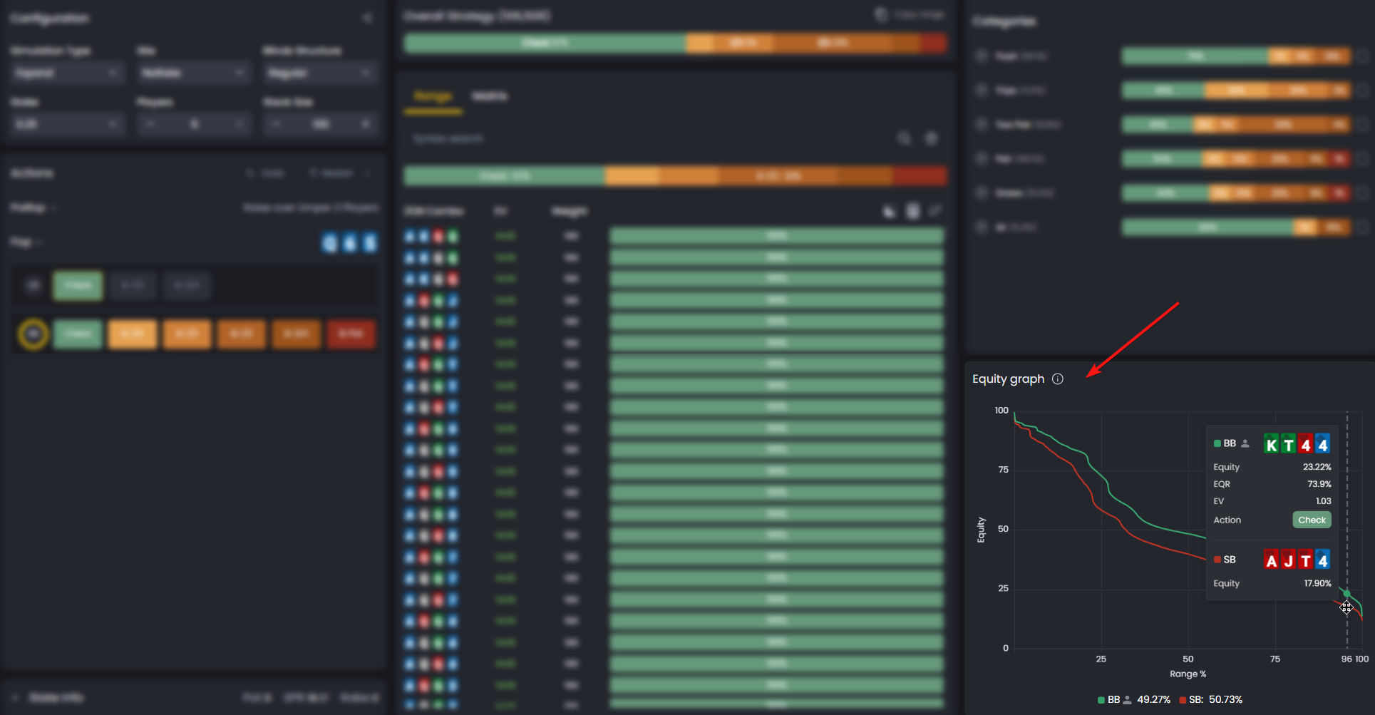
The Equity Graph, also known as the "Graph Range vs Range," is a visual tool in the Strategies section that compares the equity distribution of two players' ranges in a heads-up postflop spot. This graph helps you understand who has the range advantage and how equities are distributed from the strongest to the weakest part of each range.
By visualizing the equity matchup, you can make more informed decisions about whether to play aggressively or defensively. It's an essential tool for understanding the dynamics of range vs. range interactions in postflop scenarios.
What You're Looking At
The Equity Graph plots the equity of each player's range on a scale from 0% to 100%. The x-axis represents the percentage of the range, from the strongest hands on the left to the weakest on the right. The y-axis shows the equity of the hands at that point in the range.
- Player Lines: Two separate lines, one for each player, showing their equity distribution.
- X-Axis (Range %): Represents the percentage of the total range, from top to bottom.
- Y-Axis (Equity): Shows the hand equity at that specific point in the range.
- Overall Equity: The total equity of each player's entire range, displayed below the graph.
How to Use the Equity Graph
The Equity Graph is most useful for analyzing postflop situations where two players are heads-up.
Use the graph to answer key strategic questions:
- Who has the range advantage? The player whose line is higher on the graph for a larger portion of the range generally has the advantage.
- Who has the nut advantage? Look at the top left of the graph (0-25% of the range). The player with the higher line in this section has more very strong hands (nuts).
- How do the ranges compare at the bottom? The lines at the bottom right of the graph (75-100%) show which player has more weak hands or air.
Understanding these dynamics will help you decide whether to build the pot with your strong hands or apply pressure with bluffs when you have the range advantage.
Finding Your Leaks
The Equity Graph can reveal flaws in your preflop range construction. If you consistently find yourself at a significant range disadvantage on common flop textures, it may be a sign that your preflop ranges are too wide or poorly constructed for that situation.
Use this insight to go back and study the preflop ranges in the Strategies section. Make sure you are playing the right hands from each position to avoid starting postflop with a significant disadvantage.
Was this article helpful?
Still need help?
Join our community
Get instant support from experts and fellow players
Join Discord Community